Scenario Studio
My Role
Founding Product Designer
For this project, I was the sole designer. I conducted the research and designed the overall experience. My team included three developers and a project lead. I saw the project through from the kickoff meeting, to the launch, and through multiple rounds of iteration.
The Problem
The established product was a short term solution to a long term problem.
- The established tool was a short term solution to a long term problem.
- Our application was not collaborative.
Research
Understanding the Problem
What makes this product unique is that we were solving for internal and external needs. Prior to Scenario Studio, our clients had access to our predecessor forecasting application. This platform was lacking collaborative capabilities and had a dysfunctional navigation structure. Occasionally, our internal analysts would create forecasts for banks and other financial institutions to pass financial risk tests. Performing these tests was time consuming for our analysts and required coordination in various programs.
Design Brief
User interviews
Contextual Inquiry
Support Monitoring
To get a better grasp on this process , I conducted multiple stakeholder interviews. These interviews gave me some additional information to create a design brief that I shared with the rest of my team. After the team came to an agreement, I wanted to confirm some of the assumptions that I had about our users. By conducting contextual inquiries, user interviews and scanning through client help logs. I was able to understand key behavior patterns as well as feature prioritization.
Discovery
Key takeaways from research
External painpoint
Our Initial product overemphasized the U.S. market and our clients required a more globalized economic analysis. In addition, our clients wanted to be able to make multiple forecasts within the same screen.
Workspace: (Tabs)
The tab layout made it difficult to scan and switch between workspaces. Often words would become cut off when tab rows were at maximum capacity.
Search
Our clients found it difficult to find the data they were looking for on sidebar. In addition, other options like getting information about how calculations were made was buried in a right click interaction in the sidebar navigation.
Internal painpoint
The process of creating a global model was tedious and prone to merge failures. Country analysts would have to coordinate properly otherwise the model would crash.

Workspace
Commonly, this application was used in tandem with other files. Using it on a regular desktop proved difficult to manage while balancing between other open applications.
Search
In order for an analysts to find the data they needed; analysts would navigate around the workfile window. While this method of search was effective. It was difficult to memorize every economic series name.
Dashboard
Users were frequently verifying their forecast by analyzing a list of charts to confirm that they correlated with the rest of the model.
Designs
Data driven decisions.
After understanding the key problems, I designed multiple iterations for the workspace, dashboard, and search interface.

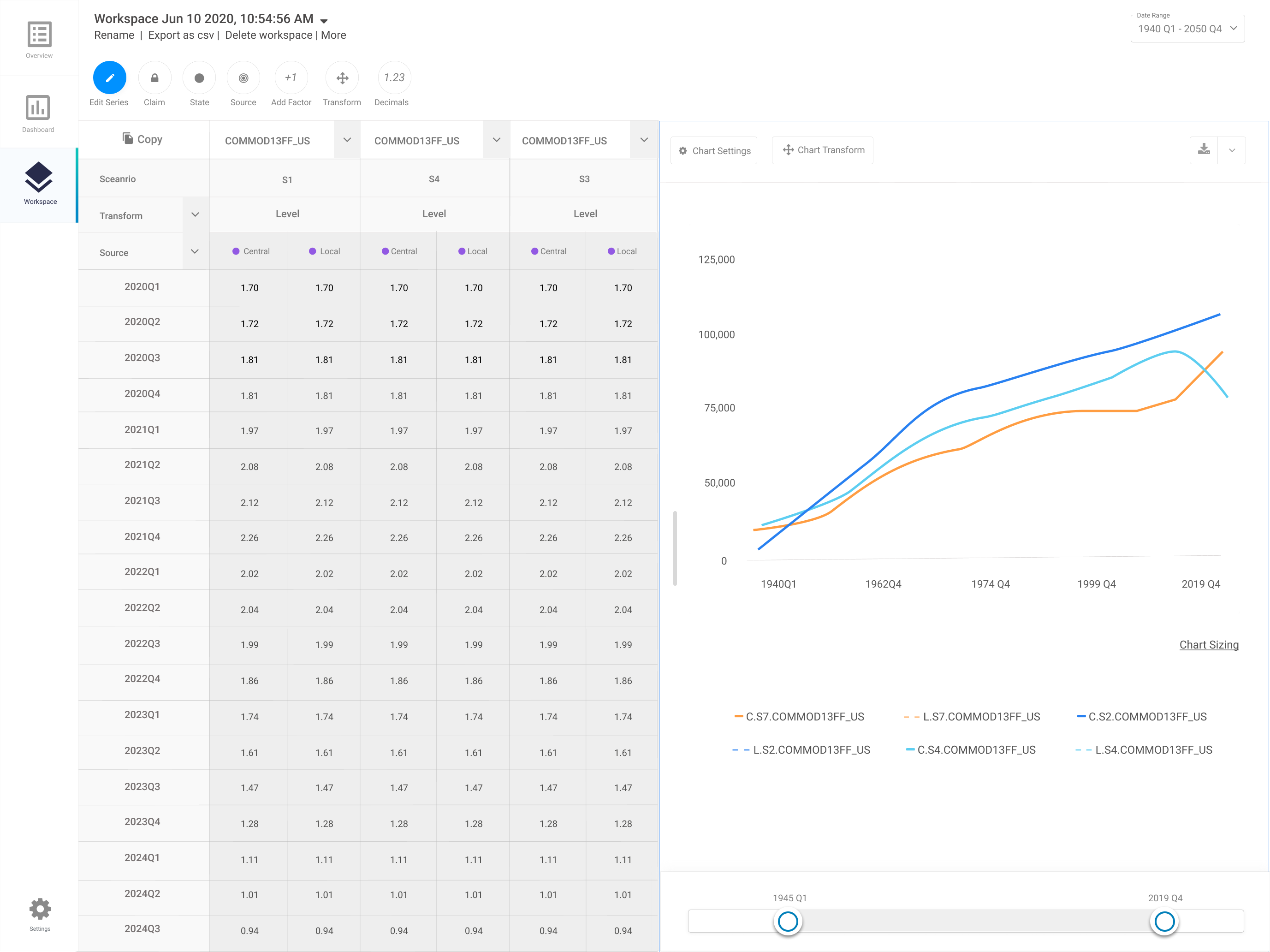
Before and After : Workspace
My original thinking behind the workspace was an object that could be accessed from multiple places. My hypothesis was that having some type filter and sort ability could decrease a users cognitive load when switching between workspaces


Before and After : Search
While building this layout, I thought about the issue of users finding it difficult to navigate to the correct data set . To solve this, I converted the sidebar navigation to a list of data sets that could be filtered and sorted through. This allowed analysts to discover additional information about economic data they were looking for.


Before and After : Dashboard
To follow the behavioral pattern of users, cross checking their predictions with multiple charts, I created a dashboard layout to decrease the time spent on-boarding. I leveraged a similar design pattern from the same same application our users used.
Feedback
Testing out assumptions
Demo Sessions
During the feedback portion of my design process , I collected user insight in different ways . Because the business was new to design thinking as a process , It was very difficult to get buy in to collect some behavioral research from our external users. Although, I was able to leverage client demo calls as a way to collect some feedback from our external users.
Early focus group session
Internal feedback channel
I started each round of my internal feedback with a focus group to discover quick underlying themes. Afterwards, I conducted contextual inquiries and cognitive walkthroughs with a few economists from those focus group sessions . To monitor and engage with Internal users we built a internal slack channel to stay close to user needs.
Outcome
Key results
77
400
5
Honestly this is the best economic modeling interface I have ever used.
-TD Bank Economist
Economic stress testing, a process that would take our economist a month was cut down to a weeks worth of work. Initially, the intention on building this product was to cut down the time spent stress testing by creating a collaborative platform. In the process of doing so we built a frictionless client friendly application that had surpassed their expectations on what an economic forecasting application could do.