Economic View
My Role
Product Designer
I worked as the individual product designer in charge of the end to end experience. During the testing phase of the design thinking process, I was able to get an additional interaction designer to assist on some of the tasks. My task included user research, interaction design, content strategy, front end development, and visual designs. I also built a component library/design system in tandem with this project . My team included four developers, two subject matter experts/authors, a marketing specialist, and a project manager.
The Problem
Decrease in the annual subscriptions from the free trial funnel and platform usage.
Key Objectives
- Increase conversion on trial and platform usage.
- Create a one stop shop and all-inclusive experience for economic analysis.
Research
Understanding the Problem
I started my process by talking with multiple stakeholders and team members. This allowed me uncover a good amount of research conducted in the past. While meeting with the customer service team, I was directed to a couple of support requests that validated our business hypothesis. Users wanted to view all of our economic coverage with one universal platform.
Support Monitoring
User interviews
During these meetings I was able to collect a surplus of research from our marketing department. Trust-building was a key factor in gaining entry to their client interviews. During these interviews, I able to refine some of the prior market research questions and ask users more about their behavioral patterns.
Discovery
Key takeaways from research
After multiple user interviews, I worked with several team members to create customer journey maps and personas that matched our clients demeanor. From a client's perspective, they wanted to download and view information related to the country of their interest. The business strategy was simple; use our existing platforms as a foundation for shipping out economic reports and white-papers.
Customer Journey Maps
Personas
By using a tier level pricing model, this allowed us to target customer segments who wanted different parts of our economic analysis. Level One, as outlined by the business strategy team, was the foundation block for the rest of the product. For this tier, we leveraged a lot of content from our previous product, the Dismal Scientist. Level Two included content from two of our lengthier products; RFR & Macro platform. These two products allowed users to download large economic analyses. Level Three focused on various economic country risks. This level started off as a consulting request from one of our larger clients. Over time, the sales team noticed that other client were asking for country risk analysis and saw this as an business opportunity to sell Level Three as an additional tier.
Analytical review

Loading...
Changes over time
Dismal Scientist Sitemap
L1 & L2 Content Matrix
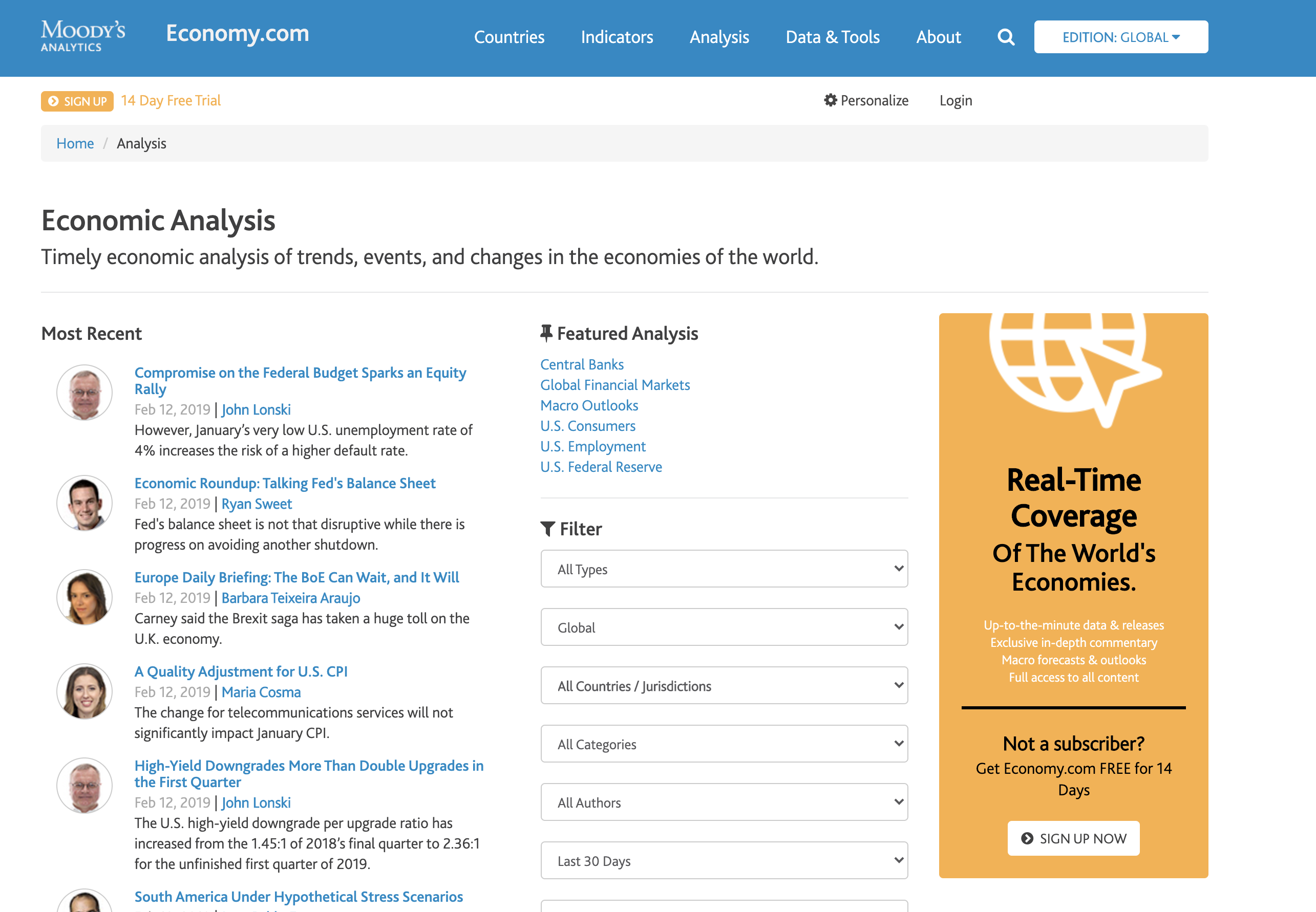
By cleaning up the global navigation , this made our goal of providing a one stop shop lot easier. To create a consistent and reliable content strategy, I built out a sitemap and content matrix. These deliverables gave us a comprehensive view on what strategic decisions needed to be made.

Designs
Simplifying complexity
.gif)
Before and After : Global Navigation

Before and After : Analysis
.png)
.gif)
Before and After : Indicators
.png)
Before and After : Trackers
Feedback
Understanding key themes
Feedback button with service blueprint plan
The goal of this feedback button was to let users express their frustrations and delight about specific interactions when navigating the economic view product .
One of the first task that I assigned to the new Interaction designer was to work with me on the service blueprint. We worked on this blueprint plan to convince our stakeholders on feasibility as well as scalability of this approach. I saw this feedback button as a long term strategy to recruit users for to research studies.
Affinity mapping user feedback
Remote Study
During our Soft launch, we got a good amount of feedback from our users. So much so that, the developers had a difficult time prioritizing and tracking the feedback. I suggested to the team that we should create an affinity diagram map that would allow us to understand reoccuring themes as well and prioritize task.
Months after the hard launch, the team and I would set up remote studies with clients that addressed their pain points with our support team .
Outcome
Key results
28
32.1
64.2
Clean and Easy to Navigate.
-HSBC Analyst